Type Walk with Shelby
- Shelby Riley
- Jul 21, 2022
- 1 min read


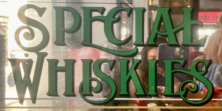


All these types were found while walking around London from July 18 - July 21, 2022. These images were found on posters in the tube, restaurants, bars, and storefronts. Some recurring designs I have noticed are thick, swooping, and outlined. Scroll below to see my top five favorites from this past week and where they were taken.
1) Red "Shop" Neon Sign

I love the simplicity, swoop, and glow of this type. This sign was found outside of the gift shop at the Museum of London on July 20, 2022.
2) Green "Point of View" Type

The way the letters slightly curve in at certain points make it look as if the foliage behind the text was peeking through. I think it is elegant and pleasing. Found on a barrier near the road near the Museum of London, July 20, 2022.
3) "Fleet Place House"

I love how the E in "place" and "house" is the same letter and how the L is part of the A. I think this is an interesting way to make a simple font feel connected and complex. Found on the corner of Holborn Viaduct and Snow Hill on the side of a business on July 21, 2022
4) "Woolwich Words & Sounds"

The bubbly letters are different and fun! Found on a poster in the Tube, July 20, 2022.
5) "Put the Wind in your Sails"

the way the letters curve really draws my attention to them. The curve gives them a nice flow and makes this poster fun to read. Found in the Tube on July 21, 2022.


Comments